MatheMAGICal Thinking: The belief that mathematics, like magic, can be used to confuse, impress and hoodwink just as much as it can to amaze and illuminate; a book based on this belief.
“Magical Thinking: The belief, especially characteristic of early childhood and of many mental illnesses, that thoughts, wishes, or special but causally irrelevant actions can cause or influence external events; thinking founded on this belief.”
“Mathematical Thinking: The belief, especially characteristic of scientists, that events can be understood, described, and predicted using mathematical equations; thinking founded on this belief.”
“MatheMAGICal Thinking: The belief that mathematics, like magic, can be used to confuse, impress and hoodwink just as much as it can to amaze and illuminate; a book based on this belief.”
Little Johnny* started Grade 2 in the lower set of math. For the previous year, Little Johnny had been distracted by baseball, baseball cards, and more baseball, and hadn’t paid much attention in math class. But it was clear he was a smart kid, he was a whizz with batting averages, runs, etc. But his times tables, dividing 17 cookies between three friends, and suchlike? Not so much.
His parents were mathematicians. And his older siblings. Aunts and uncles? Yes, them too. Does math ability skip generations?
Mommy and daddy decided to take control. How do you get any seven-year old to study? Bribery! They would give Little Johnny even more baseball cards if he did some extra math at home.
This strategy paid dividends almost immediately. At the start of the next term of the year Little Johnny was promoted to the upper math set.
It was standard procedure to test all the children in math at the start of every new term. And so Little Johnny and all the other Grade 3 children sat the test. Little Johnny was confident. But then the results came out.
These days schools aren’t keen on giving out individual scores to each child. That would be so…Victorian. We don’t want the children getting upset. Nevertheless Little Johnny did get upset. And that’s because the teachers told everyone the average scores for the two sets. And although the upper set did better than the lower set, as you’d expect, the average for both sets fell compared with the previous term’s results. And the only difference between the two terms was that Little Johnny had been promoted. It was all his fault.
There’s something initially odd about this until you look into it all a bit deeper. Even then, it’s still odd. So you need to go deeper still.
How could both averages fall? Well, it depends on how Little Johnny’s scores compared with the rest of his classes. If he was in the bottom of the lower set then removing him from the average would be beneficial to the class’s average. But he was the best in the lower set so removing him made the average of the remaining pupils fall. When he joined the smarter kids, he was (for now) probably the lowest scoring out of all of them. So again, the average for the upper set also fell. You can see how both classes might be a bit miffed. (Just a thought, but maybe the Victorians knew something about education after all.)
It all makes sense.
Except that surely the average of the two averages shouldn’t change? It’s the same pupils for the two terms so if their scores don’t change and you are simply moving one number from one set to another it won’t change the average over all of them. So if one average goes up, the other average must come down so that the average across all pupils stays the same.
No, I thought we had it cracked but it appears not.
Until we do the calculations with some numbers.
And to keep it really simple we will have two students in the lower class, one of them being Little Johnny, and one in the upper.
These are their test scores: In the lower set, 10 and 20 (that’s Little Johnny). In the upper set, 30.
The lower set has an average of 15, and the upper, rather trivially, 30. Now move Little Johnny and his score to the upper set. Now the average in the lowet set is 10, the score for the sole remaining pupil. And the average in the upper is 25. The lower average has fallen from 15 to 10, and the upper from 30 to 25. Both averages have fallen.
Let’s see what has happened. It’s all about the weighting, how many numbers there are in each average. The average across all three students is (10 + 20 + 30) / 3 = 20. You get the same average if you take 2 x 15 + 1 x 30 =60 and divide by 3, because there are two students in the lower set initially. And you get the same when you take 1 x 10 + 2 x 25 = 60 and divide by 3. Because in the second term there’s only one student in the lower class but two in the upper.
Little Johnny is doing so well in his math now, he almost understood why both averages fell. Next year they’ll have to start a new upper upper set just for him!
Recent Cambridge University research, published in the journal Philosophy and Technology, warns about the dangers of machine learning. The below is taken from the Daily Telegraph.
Artificially intelligent recruitment programmes are discriminating against people who wear glasses or sit in front of bare walls, academics have warned, as they urged companies to stop relying on pseudoscientific software.
In video interviews, AI programmes tended to favour people sitting in front of bookshelves or with art on their walls. They also recommended applicants wearing head scarfs, believing them less neurotic, while judging people who wore glasses as less conscientious.
The team said using AI to judge personality was automated pseudoscience reminiscent of physiognomy or phrenology- the discredited beliefs that character can be deduced from facial features and skull shape.
We are concerned that some vendors are wrapping snake oil products in a shiny package and selling them to unsuspecting customers, said co-author Dr Eleanor Drage.
Pseudoscientific?! Someone once said to treat every obstacle as an opportunity. So here goes.
IBM, M&S, Walmart stocks? Booooring! Alternative investments? Crypto, wine,…Coooooool!
Scenario: You have ambitions to be a hedge fund manager. But the competition for investment money is stiff. You might have some programming skills and a LinkedIn profile. What more do you need? You need a gimmick, to make you stand out from the riff-raff.
Solution: Artificial intelligence for alternative investments…AI for AI…it would be a crime not to! That’s our gimmick. Let’s do the math.
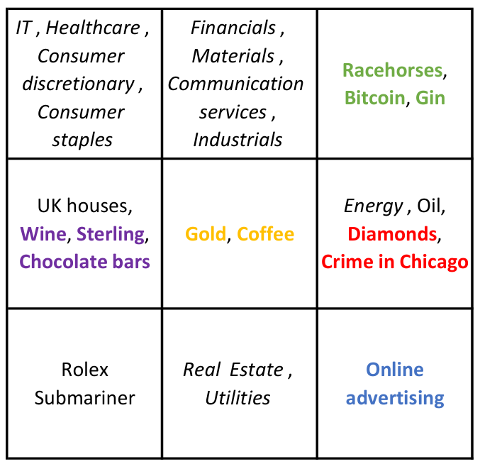
Here are the sectors for the (boring) classical investments: Energy, Real Estate, Financials, IT, Materials, Healthcare, Industrials, Consumer Staples, Utilities, Consumer Discretionary, Communication Services.
Let’s get creative with some less, ahem, traditional investments. I’m going to include a few fairly standard investments, but then I’m going to let rip. In increasing order of weirdness: Sterling, Gold, Oil, Coffee, Bitcoin, UK houses, Wine, Racehorses, Diamonds, Online advertising, Rolex Submariner watches, Gin, Chocolate bars, Crime in Chicago.
No, your eyes aren’t playing tricks on you, I’ve included gin, chocolate, diamonds. And crime. Does it pay? Let’s see.
I downloaded data for all of the classical sectors and the alternatives. Getting data for the alternatives was tricky to say the least. But, hey, that’s not an obstacle, it’s an opportunity! No other potential hedge fund manager is going to be looking at the same data as us!
For example, for racehorses I got data from Statista for the sale prices of racehorses in Ireland. I know from personal experience that the sale price of a racehorse does not capture the realities of investing in them. The costs of ownership are staggering. But, hey ho. Data for Rolex Submariner watches from Googletrends. Simply interest shown in this particular watch. Not in the slightest bit financial. Crime in Chicago, ok, I couldn’t resist. Is there still any link between crime in Chicago and the liquor trade, or was that link broken almost a century ago? Data from the City of Chicago website. The data is not financial, simply quantity of crimes each year. No allowance for quality.
I converted all data into US dollars, that was more art than science. And looked at annual returns over ten years. I then applied a wonderful machine-learning method called self-organizing maps (SOM).
SOM is an unsupervised-learning method that groups together data points using distance between the feature vectors (here the returns). The data points are then mapped onto a two-dimensional grid, think chessboard, so we can visualize which data points/feature vectors have similar characteristics. Or think moving similar people to the same table at a wedding. And the closer the tables the more similar the people at those tables will be. Tables far apart are very dissimilar, the aunts and uncles no one talks about, or to. (One way that the wedding-table analogy falls down is that at weddings there are usually the same number of people at each table. In SOM some tables are more popular than others.)
And this is what I found.
Each cell represents ‘investments’ that are similar. So IT, Healthcare, etc. are similar to each other and very different to racehorses and gin. No kidding. By spreading money across the nine categories we increase diversification and so reduce risk. So some IT shares, a financial or two, a racehorse, definitely plenty of gin, some diamonds (maybe pass on the crime), and so on.
This is then the information that goes into our pitch for raising money for our hedge fund. “Our fund is unique in applying cutting-edge artificial intelligence to portfolios of alternative investments. By exploiting the non-linear blah blah maximization blah blah we construct portfolios to optimize diversity and so blah blah.” Irresistable to those allocating money to new funds. (And if we get comped watches, fine wines, diamonds, and a racehorse leg or two, well, so be it.)
And the point of this exercise?
The beauty of machine learning is that it is fun to do. Usually very easy, there is always some Python code you can use. The hardest part of putting together a pitch like this is in finding the data in the first place, and choosing the best typeface for the pitchbook.
You also always get an answer. With classical mathematical modelling, you might spend months or years perfecting your model, only to find a flaw and have to throw it all away. But not having a clue what the algorithm is doing inside its black box means you might not find out that there is a major problem until after you’ve lost all of your investors’ money.
But not knowing what is inside the box is not a bad thing. If you can’t see it, then nor can your investors. Remember, these aren’t obstacles, they are opportunities.
Disclaimer: This information is for general informational purposes only and does not constitute financial, legal, or tax advice. It is not intended to be a substitute for professional advice. You should consult with a qualified professional before making any financial decisions. Past performance is not indicative of future results. The information provided is not an offer to sell or a solicitation of an offer to buy any securities or other financial instruments. We are not responsible for any losses or damages that may arise from your reliance on this information. I hope all that is obvious.
The economist Paul Romer once compared the models used in finance with the tricks used by magicians, whose secrets are protected by the Magician’s Oath. As he wrote in 2015, “A model is like doing a card trick … Perhaps our norms will soon be like those in professional magic; it will be impolite, perhaps even an ethical breach, to reveal how someone’s trick works.” [Spoiler alert: guilty as charged.]
Of course, nothing can be kept secret forever, so once a magician has invented something like a levitation trick, as illusionists did some two centuries ago, other versions soon follow. Today, you can find explanations on YouTube, or Wikipedia. But for most audiences, the trick will still be effective.
An example of such a mathemagical trick is the Black-Scholes model, which since its publication in 1973 has served as the industry-standard model used to price financial options – those instruments which give one the right but not the obligation to buy (a call option) or sell (a put option) a stock in the future at a set price, known as the strike. The model is magically simple: in order for the price of the option to be revealed, traders only need to supply two key pieces of information: the risk-free interest rate, which can be obtained from something like a Treasury bond, and the volatility, which is an estimate of price variation (technically, it is the standard deviation of the logarithm of price changes over a period such as a year).
As financial magic shows go, the Black-Scholes model has certainly had a good run – one of the longest on Wall Street, and elsewhere – and has received rave reviews. One commentator (Ross, 1987) described option pricing as “the most successful theory not only in finance, but in all of economics.” Another (Rubinstein, 1994) said the algorithm may be “the most widely used formula, with embedded probabilities, in human history.” Even critics acknowledge the model’s importance to the field; Nassim Nicholas Taleb (1998) wrote that “Most everything that has been developed in modern finance since 1973 is but a footnote,” while in his 2008 report to shareholders Warren Buffet said it had “approached the status of holy writ” (magic being closely related to religion).
A popular component of magic shows is the prediction trick, where the magician makes a seemingly impossible prediction about an audience member or something else. The Black-Scholes formula does this but with a twist. Its trick is to present itself, not so much as a prediction, but rather as a magical machine which somehow defines the correct option price – like a mentalist who predicts the future by making it happen. And by using the machine as a calculating device, investors only seem to confirm its predictions. What kind of higher-level voodoo is this?
Such is its hypnotic hold, that it defines the very words and concepts used by quants to describe option pricing. For example there is the “implied volatility” which is the special number that must be fed into the machine in order for it to work, but whose true value can be divined only in hindsight. And then there are the “Greeks” which refer to various terms thought to describe its sensitivities, and are reminiscent of the arcane symbols employed by sorcerers. For example the symbol Δ shows how the option price depends on the current asset price, while Θ measures its dependence on time.
Even more remarkable is that the mesmerising power of the model’s spell has distracted the audience from worrying about – or often even noticing – the fact that its assumptions have no more obvious means of support than a magician’s levitating assistant.
Suspending disbelief
For example, one of its totems is that markets are “efficient” so are made up of what economist Eugene Fama (1965) called “rational profit maximizers” whose collective actions ensure that everything is priced rationally, including assets and options. If anyone still think markets are rational and efficient, then see below.
Much of the power of the model comes from its amazing use of “dynamic hedging” which assumes that someone can constantly buy and sell options and the underlying stock in such a way that the risks are always balanced. The theory appears to mathematically prove that the value of an option does not depend on the growth of the underlying asset (which is why the formula uses only the risk-free rate). And yet it obviously kind of does, which is why for something like the S&P 500 index, which tends to grow, call options (to buy) have consistently outperformed put options (to sell). This is a problem, since the test of the model is not to satisfy some abstract theorem, or even to predict what traders are paying for options; it is to predict what prices correspond to the expected payouts.
The model assumes that prices follow a “random walk”, so the probability distribution for price changes should be lognormal (i.e. the log price changes should follow a bell curve). But, it’s not. It has “fat tails” meaning that the chances of extreme price changes, such as a crash or a spike, are much higher than predicted by the model.
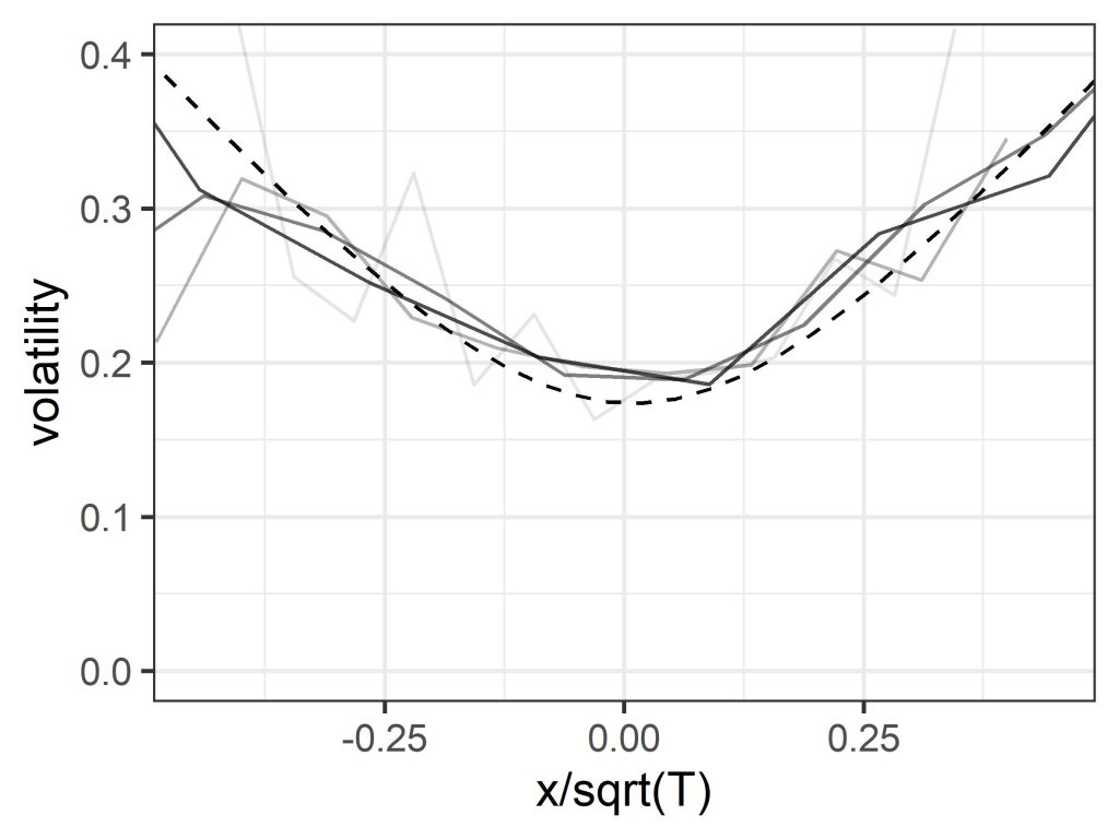
The model also assumes that volatility over a set period can be treated as constant, and in particular does not depend on the strike, which again is the reference price for the option. But if you plot volatility versus price change for historic asset price data it turns out that there is a distinct smile shape, with volatility lower for periods over which the price change is small, and climbing higher as the price change becomes increasingly positive or negative. (Note that price change is clearly related to the strike price, since options with different strikes can be viewed as the same option with a corresponding assumed price change.) A similar “volatility smile”, though somewhat less pronounced, is seen when the implied volatility used by traders is plotted versus strike – a clue left in plain sight.
The markets are smiling, but Black-Scholes doesn’t get the joke. Figure shows plots of volatility over time periods of 1, 2, 4 and 8 weeks (light to dark), for the S&P 500 index (1992-2022), compared with a prediction using a quantum model (dashed). The horizontal axis is price change x normalised by the square-root of time T. The Black-Scholes formula assumes volatility is constant so these lines are all flat.
Finally, that dynamic hedging proof, which in a wave of its magic wand appeared to remove the dependence on subjective estimates of future growth, demands that you can constantly buy and sell securities and options to eliminate risk. This ignores the bid-ask spread (the difference between the buyer price and the seller price) on those transactions – which is not a technical detail, but represents a level of irreducible uncertainty, whose magnitude is related to the volatility. Include those, and the clarity, certainty, and elegance of the mathematical demonstration loses some of its theatrical sparkle. (The dashed line in the above figure was derived from a quantum economics model, which uses a different kind of magic.)
How to be beaten by the market
Now, most people in the audience will be untroubled by these details – or won’t perceive them at all – because they will tell themselves that (a) the model has a great back story and is rooted in highly rational mathematics, and (b) what ultimately counts is that the magic formula is widely known to give the “right” answers (i.e. correct predictions of the fair price), at least if we set aside the occasional stage malfunction such as the 1987 Black Monday crash, the 1998 LTCM blow-up, the 2007/8 financial crisis, and so on, where use of the model led to large losses. (Advocates of efficient market theory can explain all of these, thus falsifying the theory that theories in finance can ever be falsified.) Any nagging doubts can be addressed by inventing elaborate excuses, or by noting that no model is perfect, the Black-Scholes model has the advantage of simplicity, it is very useful as a mental tool, traders adjust the price anyway, and so on.
Only, the model doesn’t give the right answers, its predictions are off, the crystal ball is cracked. Here’s another clue: suppose you agreed to buy lots and lots of 1-month at-the-money S&P 500 straddle options (a combination of a call and a put), at the price suggested by the model using the benchmark (VIX index) volatility, and kept reinvesting the takings. If markets are efficient, and the model is telling the truth, then in principle you should expect to break even over a sufficiently long period of time. Except you won’t, you’ll lose money, in an efficient manner (this is not financial advice). In fact, you would overpay by a factor about equal to the square-root of two.
Losses will be reduced if you pay the actual market price for these options, since traders feed the oracle a lower volatility number, but they will still be significant, which again seems to contradict the efficient market hypothesis. The reason is that volatility, which is the mysterious essence at the heart of the trick, isn’t actually a thing, at least in the sense assumed by the formula. You can measure price changes over a previous period and calculate a standard deviation. Since conditions are always changing, the answer you get will depend on the exact period, so you might try to adjust for this somehow. But if the future variability is itself a highly variable quantity which depends, like expected price change, on the state of the market, then there is no single volatility that is independent of strike.
Also, since dynamic hedging isn’t a thing either, the assumption that the growth rate equals the risk-free rate – with no need for subjective estimates or uncertain predictions – is itself just a particular choice or prediction, and one which is not backed up by empirical data. The whole carefully-constructed illusion of deterministic objective rationality shatters into pieces.
All this won’t spoil the entertainment as long as people don’t look too hard behind the scenes, or check what’s going on using actual statistical tests (there being more data now than in 1973). But this still leaves the question of how this trick works. How does it get so many people to take the word of an elegant but obviously idealised mathematical proof, instead of confirming whether option prices correspond to expected payouts, which is the normal test for a statistical predictive model? Or to go along with the idea that the volatility smile is a puzzling anomaly or “logical inconsistency” (as it has been called) caused by market quirks, or irrational behaviour on the part of traders, instead of being a reflection of a real phenomenon? And how does a square-root of two error get magicked out of existence?
The logic hack
Part of the reason for the trick’s success is that, as already mentioned, it substitutes the usual test of a model, which is to predict outcomes, with a different test, which is to obey an abstract proof based on certain assumptions, thus again rendering it unfalsifiable. But at a deeper level, the secret behind the trick is that it induces in its audience what might be described as model blindness. As quants Emanuel Derman and Michael Miller (2016) note, the model “sounds so rational, and has such a strong grip on everyone’s imagination, that even people who don’t believe in its assumptions nevertheless use it to quote prices at which they are willing to trade.” By hacking (like a hypnotist on a hapless showgoer) into people’s ideas about rationality, it changes their perception of reality, and even the language they use to describe it, so the model’s word takes precedence over observable facts (the smirking volatility, the money-losing options). Which is quite a mind-blowing stunt.
Of course, like most tricks it wouldn’t have worked if the people in the gallery hadn’t at some level wanted it to work. But the real audience back in the 1970s, when it first came out, wasn’t just options traders – it was society as a whole. The illusion of predictability, objectivity and rationality was at the time in a sense necessary and productive, because it transformed options trading from a slightly disreputable form of gambling, into scientific risk management, and thus helped conjure into existence much of the quantitative finance industry. A shared language acted as a coordination device which allowed traders to communicate and do business. The audience was therefore part of the performance, and shared in the magical profits (one could even say that they, more than the inventors themselves, were the magicians who made the trick work). And it was all just one component in an even longer-running magic show, which is the neoclassical illusion that the complex, unstable, living system known as the economy is actually a rational, efficient, utility-maximising machine. Magicians have traditionally tried to convince people that the automaton is alive, but here it is the other way round.
The Black-Scholes model is one of the greatest mathemagical tricks of all time. But now, it might be time for us to snap out of this illusion, open our eyes, and let go of this idea that markets are efficient and obey rational logic. After all, it always did sound a little crazy.
An earlier version of this article appeared in the July 2023 issue of Wilmott Magazine.
I don’t believe in conspiracy theories but — whenever you hear the “but” you know exactly what is coming! — there is one story that is rather worrisome, and also something to which one can trivially add a bit of mathematics as a convincer.
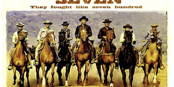
Did you know that the actors in The Magnificent Seven died in real life in the order in which they died in the movie?
To remind you the seven were, as copied from Wikipedia,
YulBrynner as Chris Adams, a Cajun gunslinger, leader of the seven
Steve McQueen as Vin Tanner, the drifter
Charles Bronson as Bernardo O’Reilly, the professional in need of money
Robert Vaughn as Lee, the traumatized veteran
Brad Dexter as Harry Luck, the fortune seeker
James Coburn as Britt, the knife expert
Horst Buchholz as Chico, the young, hot-blooded shootist
You don’t have to take my word for it, it’s easy to google.
I remember discussing this over dinner at a training course in Mexico City. We even got as far as looking at the probability of this happening. How can you order seven people? For the first one there are seven to choose from. For the second there are six remaining. Then five, and so on. This means that the probability of this being a coincidence is one in 7! (that’s seven factorial), i.e. about 0.02%.
Can you explain this any better than chance?
Maybe they died in the movie according to their ages. You could check that out. That would make some sense, the older gunfighters die sooner in the film, and the older actors die earlier in real life.
We could probably quite easily quantify this effect, to increase that 0.02%. But it’s hard to get the probability up to anything remotely probable.
This is the way the dinner conversation went.
One matter that was not discussed, perhaps out of politeness since I was the teacher and they were the students, was that maybe I WAS MAKING IT UP ON THE SPOT, YOU MUPPETS!
My apologies. This conspiracy theory, like all of them, has no basis in fact. But it was fun while it lasted. My mathemagical distractions, the statistical analyses, trying to find rational explanations, all served to convince my audience that there must have been a plot! I should have got an Oscar for my performance!!
The two most famous
theories in the field of forecasting are the butterfly effect, and the efficient
market hypothesis. Both are theories, not of prediction, but of non-prediction.
The butterfly effect was
developed by MIT meteorologist and chaos theorist Ed Lorenz in the 1960s. He
found that computer simulations of a toy weather model tended to stray apart
over time if the starting point was changed by even a tiny amount (chaos!). He
proposed that this “sensitivity to initial condition” was a property, not just
of his three-equation model, but of the weather itself. When he submitted an
untitled talk for the 1972 conference of the American Association for the
Advancement of Science, the person hosting the session supplied a provocative title:
“Predictability; Does the Flap of a Butterfly’s Wings in Brazil Set Off a
Tornado in Texas?”
The efficient market
hypothesis was first proposed in a 1970 PhD thesis by Eugene Fama, from the
University of Chicago. It says that price changes in financial markets are caused
by random perturbations (e.g. news) and therefore follow a “random walk” which
is inherently unpredictable.
Apart from fame, the
theories have many other things in common. They both provide a scientific
reason for forecast errors, such as the financial crisis. They both assume that
forecast error is due to random effects (insects or news). Both theories – or at
least their typical applications – assume that the underlying model of the
system is correct. And they are both used to justify complicated techniques
that are hard to interpret or falsify.
In the 1990s weather forecasters seized on the butterfly effect as an excuse for forecast error, but also as a rationale for elaborate “ensemble forecasting” schemes. Instead of making a single “point” forecast, an ensemble of forecasts is here generated from a set of perturbed initial conditions, and used to produce a statistical forecast that takes into account the effects of chaos. When forecasters made typical perturbations of the sort that might be produced by observational error, they found that the simulations didn’t diverge as quickly as expected, which was possibly a hint; however they soon found ways to select specially optimised perturbations which did exhibit the desired divergent behaviour.
The efficient market
hypothesis meanwhile might have shown that price changes were unpredictable,
but also enabled the use of statistical models which claimed to predict the
probability of a price change, such as the Value at Risk model. In either case
of course the statistical forecast is only valid if the underlying model of the
system is correct.
Both theories are hard to
disprove, and remarkably resilient to criticism. When I (David) showed in a 1999
presentation at the European Centre for Medium-Range Weather Forecasts that
plots of forecast error show a square-root shape, which is characteristic not
of chaos but of model error, I was contradicted by a number of people in the
audience. The next day I received an email from one of the top research heads,
which said that he had checked a plot of forecast errors, and, in stark
contrast to my talk, “they certainly show positive curvature.” In other words,
they were caused by chaos, not model error. We therefore decided that someone
there should try to reproduce my results, by plotting the errors as a function
of time.
When the results showed a
near-perfect square-root shape, I received an email saying that “I guess it
would be possible to get an initially square root shape from initial condition
error if the error was initially in very very small scales which rapidly
saturates but cascades up to produce
errors of larger scale, which then saturate, but cascade up to produce errors of
still larger scale.” (That was the exact point when my view of science began to
shift.)
Similarly, as Andrew W. Lo
and A. Craig MacKinlay wrote in their book A Non-Random Walk Down Wall Street: “One of the most common
reactions to our early research was surprise and disbelief. Indeed, when we
first presented our rejection of the Random Walk Hypothesis at an academic
conference in 1986, our discussant – a distinguished economist and senior
member of the profession – asserted with great confidence that we had made a
programming error, for if our results were correct, this would imply tremendous
profit opportunities in the stock market. Being too timid (and too junior) at
the time, we responded weakly that our programming was quite solid thank you,
and the ensuing debate quickly degenerated thereafter. Fortunately, others were
able to replicate our findings exactly.”
Needless to say, both the
butterfly effect and efficient market theory survived these and other challenges.
Finally, both theories rely on a kind of magical thinking – that the atmosphere is incredibly sensitive to the smallest change, so perturbations grow exponentially instead of just dissipating (try waving your hand in front of your face to see which is more physically realistic); or that the economy is magically self-correcting, like a door which snaps instantly shut after being opened.
One difference is that the butterfly effect does double duty in other areas such as economics. As then-Fed chairman Ben Bernanke explained in 2009, “a small cause – the flapping of a butterfly’s wings in Brazil – might conceivably have a disproportionately large effect – a typhoon in the Pacific” which was a useful thing to bring up after you just failed to predict the US housing crisis. However, the idea that unpredictability is caused by efficiency has failed to catch on outside of economics. For example, no one thinks that snow storms that come out of nowhere are efficient.
So why are these theories both still around? The reason is simple. As the physicist Richard Feynman once said, “The test of science is its ability to predict.” The magic of science is the ability to make it look like you can predict.
The following may or may not be factually accurate. It all happened a long time ago. But it is absolutely 100% correct in spirit.
Twenty or so years ago I was browsing through the library of Imperial College, London, when I happened upon a book called something like The Treasury’s Model of the UK Economy. It was about one inch thick and full of difference equations. Seven hundred and seventy of them, one for each of 770 incredibly important economic variables. There was an equation for the rate of inflation, one for the dollar-sterling exchange rate, others for each of the short-term and long-term interest rates, there was the price of fish, etc. etc. (The last one I made up. I hope.) Could that be a good model with reliable forecasts?
[Hint: How good are economic forecasts generally?]
Consider how many parameters must be needed in such a model, every one impossible to measure accurately, every one unstable. I can’t remember whether these were linear or non-linear difference equations, but every undergrad mathematician knows that you can get chaos with a single non-linear difference equation so think of the output you might get from 770.
Putting myself in the mind of the Treasury economists I think “Hmm, maybe the results of the model are so bad that we need an extra variable. Yes, that’s it, if we can find the 771st equation then the model will finally be perfect.”
No, gentlemen of the Treasury, that is not right. What you want to do is throw away all but the half dozen most important equations and then accept the inevitable, that the results won’t be perfect.
A short distance away on the same shelf was the model of the Venezuelan economy. This was a much thinner book with a mere 160 equations. Again I can imagine the Venezuelan economists saying to each other, “Amigos, one day we too will have as many equations as those British cabrones, no?” No, what you want to do is strip down the 160 equations you’ve got to the most important. In Venezuela maybe it’s just a few equations, for the price of oil, inflation, and maybe how much it costs to buy a politician.
We don’t need more complex economics models. Nor do we need that fourteenth stochastic variable in finance. We need simplicity and robustness. We need to accept that the models of human behaviour will never be perfect. We need to accept all that, and then build in a nice safety margin in our forecasts, prices and measures of risk.
I love watching Dragons’ Den, the programme in which entrepreneurs try to get established business people to invest in their ideas. I love trying to predict which Dragon will say what, how they will negotiate a deal, how they compete with each other to make themselves look good against other Dragons. I love shouting at the TV, “What about patents and intellectual property?” before the Dragons. And I particularly love it when they so obviously get it wrong. Trunki? Come on, just because a bit of plastic broke on a prototype you aren’t going to invest in such an obvious hit? And I find it reassuring when they break all their own rules to invest in something they get emotionally attached to. E.g. Reggae Reggae Sauce. Although I’m sure it is deliciously invigorating many of the facts and figures that the entrepreneur gave turned out to be wrong, many of them during the programme itself.
But I hate it when an entrepreneur gets flummoxed by a Dragon negotiating for a better deal. An entrepreneur will open with offering 10% in return for a certain investment. A Dragon might find this too little and counter with 20%. At which point the entrepreneur shakes his or head and declines.
What are they thinking?
It looks to me like they are thinking from the perspective of the Dragon. I’m going to double his money? Double! No way!
But this is completely the wrong way to look at this. They should look at it from their own perspective initially. So I’m going down from 90% to 80%. No biggie. And then they can put themselves in the shoes of the Dragon. Ok, I can see that doubling the shareholding might double the help the Dragon will give. Which will make that 11.11% reduction in their shareholding (10/90) look pretty insignificant.
One of the first lessons in any course on investing will be about portfolio construction and the benefits of diversification, how to maximize expected return for a given level of risk. If assets are not correlated then as you add more and more of them to your portfolio you can maintain a decent expected return and reduce your risk. Colloquially, we say don’t put all your eggs into one basket.
Of course, that’s only theory. In practice there are many reasons why things don’t work out so nicely. Often that’s because stocks and other investments stubbornly refuse to do what they are told.
But can it ever be optimal to not even try to diversify? Should you ever do the exact opposite of Rule #1? You betcha.
As we’ll see people in banks and hedge funds are encouraged to not diversify, to instead concentrate risk. I don’t know whether this is explicit or instinctive.
Imagine the following scenario. It’s your first day as a trader at an investment bank. You’ve had a world-class university education in economics in, say, Chicago. There you learned about all kinds of theoretically marvellous trades and how to manage risk by diversifying.
You are being introduced to the rest of the trading team. You notice that all of the trades they are doing are strangely similar. It worries you a bit because it doesn’t look like they are diversifying much.
You are then shown your desk, with multiple screens, and told to start trading.
Being a decent person you naturally want to do the best for your bank and so you seek out some trades that are uncorrelated to those of your colleagues but which also have a high probability of success.
Let’s put some numbers to this. There are dozens of other traders all making the same trade, and this trade has a 50:50 chance of making or losing a large amount. You have a better, and independent, trade that has a 75% chance of doubling your money and 25% of losing it all.
What happens next?
There’s a 50% chance that all the other traders lose a vast amount of money. This is not great. They might lose their jobs. The bank might go under.
But there’s also a 50% chance that they’ll be heroes, and rewarded as such in bonuses.
Meanwhile your trade might make some money. More likely than the other traders, at 75%. So you are more likely to be a hero too. No! If the others lose and you win then you are too tiny to even be noticed. You won’t be able to save the bank. And certainly don’t expect a bonus.
You can see this in the following table. If the other traders lose then everyone is fired including you. You can only get a bonus if the traders and you both win, and that has a probability of 0.75 x 0.5 = 37.5%.
Traders
win (50%)
Traders
Lose (50%)
You
win (75%)
Bonuses
all around!!! (37.5%)
All
fired!!! (37.5%)
You
lose (25%)
You are
fired,
other traders
get bonuses (12.5%)
All
fired!!! (12.5%)
No, the only way to get that bonus is to cling to the coattails of the other traders. Do the same trade as them and you have a larger 50% chance of that bonus.
Lose money when all around are making it, you’re fired. Make money when all around are losing it? Expect a big bonus? No way! Your profits will help to bail everyone else out and no one gets a bonus, even you. No, you should do the same as everyone else.
As Keynes said, “It is better to fail conventionally than to succeed unconventionally.”
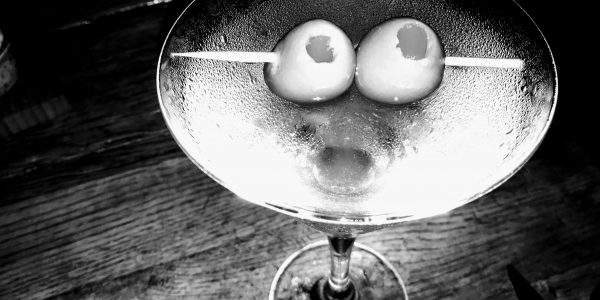
The original classic martini cocktail is two thirds gin, one third dry vermouth shaken with ice (if you are James Bond) or stirred (for Somerset Maugham). The ratio of vermouth to gin has decreased over the years, reaching a lower limit with Noel Coward, “A perfect martini should be made by filling a glass with gin, then waving it in the general direction of Italy.”
You can use vodka instead of gin in a vodka martini. Or both, as favoured by Bond, who also specified Lillet instead of vermouth. Lillet isn’t technically a vermouth. Although it is also a fortified wine only vermouth contains wormwood.
To confuse matters there is a brand of vermouth called Martini. This may or may not have been the source of the lower-initial-cap cocktail’s name.
I’m thirsty.
Before getting too carried away (from under the table?) let’s look at some of the mathematics of the martini.
It is the best of drinks and the worst of drinks.
The best is clear. But why the worst? It is because it is so depressing drinking one. Not because of the depressive effects of alcohol but because of the shape of the glass. I shall explain. But first a question.
The classic martini glass is cone shaped. Suppose you have a generous bartender who fills your glass to the brim. You sip. Before you know it the martini is half way down the glass. How much drink is then left?
This is where you get to think like a mathematician. Although that is rarely so depressing as here.
The martini glass is a cone. To mathematicians the cone is a three-dimensional (although this can be generalised) body having a horizontal cross section that is the same shape at any position and where the size, say diameter, of that shape increases linearly with the height of the cross section. We think of the cone having circular cross sections. But that need not be the case. The Egyptian pyramids are also cones.
The bottom half, or any fraction, of the martini glass is therefore the same shape, technically “similar,” to the whole martini glass. This wouldn’t be true of, say, a champagne flute. The bottom of the flute is flattish, but higher up the sides are steep. The sides of the martini glass are always the same angle from bottom to the rim. And it doesn’t matter what that angle is, as long as it’s the same all the way up.
This means that the relationship between the volume of the liquid and its depth is very simple. You just take the fraction of the height of the level of the liquid to the depth of the original and then raise that to the power of three. Why three? Because we are working in three dimensions.
This means that if we are already (so soon?) half way down then the remaining volume is one eighth of what we started with.
You see why that is depressing. Most people when asked about this will say something like, oh there’s about one third left. But, no, it’s far worse than that.
I hope I haven’t spoiled your drink. Don’t be like me. As I see the level falling I am continually in advance thinking about how little is left. No wonder I have to order a second.
Oh, and avoid olives, they make the mathematics even more depressing, large olives, less alcohol.
There are many quotes by famous people about problems being opportunities.
“The block of granite which was an obstacle in the pathway of the weak, became a stepping-stone in the pathway of the strong.” Thomas Carlyle.
“Every problem is an opportunity in disguise.” John Adams.
“Never let a good crisis go to waste.” Attributed to many.
All sensible and inspirational twists on setback.
We are going to apply a similar twist to rather gross facts. And in so doing highlight how mathematics can be used to frighten the unsuspecting.
Did you know that one in six mobile phones are contaminated with faecal matter? And cell phones carry ten times as many bacteria as toilet seats? Forty percent of office coffee mugs contain coliform bacteria, found in faeces. Forty percent! It gets worse. It is estimated that there is faecal matter on 72% of shopping carts. And shoes? Don’t go there.
Boy, how those numbers frighten us!
And those numbers also sell cleaning products. (Oh, sponges are about the most contaminated things there are.) And newspapers and magazines.
But we are looking at those numbers the wrong way. It’s the old problem/opportunity thing in disguise.
Have you used your cell phone today? Yes. Had a coffee in an office mug? Indeed. Worn shoes perhaps? Check. And are you currently ill? Me neither.
What’s the correct conclusion from the data then?
In the famous words of Corporal Jones, “Don’t panic!” As long as people’s health doesn’t get any worse then generally speaking the more germs there are the better. It simply mean that those germs aren’t as bad as their PR makes out.